
What is Graphic Design ?
Graphic design is the process / medium where Various text, images, symbols and sounds to convey message to others.
It is a problem solving activity where it can be planed, mapped and include drawing or illustration for explaining the main propose of communicating specific message to targeted audience.
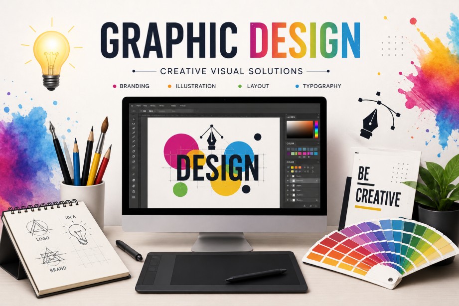
Graphic Design specifically concentrates on providing message visually to make it attractive and eye catching for easy understanding, which looks effective and beautiful. It is a skill where ideas are combined with technology to present information, selling product or services about particular thing visually.
Graphics design provide us information in complete creative and beautiful way where we love to be get involved unknowingly. It also guides us in our daily life, where ever you look you found your self surrounded by graphic designs for eg: in the street sign boards, shop banners, in road and in many more which helps us as a guide and we react according to the information that is provided.
5 Powerful Objectives of Graphic Designer
- To be able to communicate through visual elements combining ideas.
- To have knowledge about the tools that is being used for designing.
- Solving communication problems with creative designs solution of the related problems.
- Providing better user experience in printing and digital media.
- Building a strong memorable brand identity.
4 Basic Fundamental Principles to follow
Basic principles can be summarized in one word that is CRAP.
- Contrast
- Repetition
- Alignment
- Proximity
Contrast
Contrast is one of the basic principle of graphic design where it shows the difference among two or more designing elements, making each element different from another. It helps to understand easily and improve readability which creates visual interest.
Types of Contrast:
- Color Contrast
- It uses different colors to make it look different and attractive which helps to create important elements such as buttons and headlines stand out.
- Shape Contrast
- It has various of different shapes like rectangle, square, circle and also organic shapes with geometric type which create variety and visual appeal to design.
- Typography Contrast
- It is basically related to the text which is differ by their size, font, style and weights for example, A bold heading paired with a light, small paragraph.
- Size Contrast
- It is a combination of small and large elements that helps to make designs look good. Example like, A large headline with smaller body text emphasize the main message.
Repetition
Repetition a basic principle of graphic design that involves the process or reusing the same or similar visual elements throughout the design. This includes elements like colors, fonts, shapes, line, icons and many other. Example: A company’s brochure uses the same color, logo and font style on every page. This repetition makes a unified, professional look and reinforces the company brand identity.
Alignment
Alignment is a fundamental principle of a graphic design that refers to arranging design elements in a organized and visually connecting way for proper balanced, clean and professional appearance.
Types of Alignment:
- Left Alignment
- Here text or an object are aligned along left edge which is the most common alignment for the body text.
- Center Alignment
- In this alignment elements are kept on center, creating a formal balanced look in design.
- Right Alignment
- In this text or an objects are aligned along the right edge which is often used for emphasis or special layouts.
- Justified Alignment
- Here the text is aligned evenly on the both left and right edges which provides neat and clean rectangular appearance.
Proximity
Proximity is also one of the fundamental principle of graphic design where it places the related elements close together and unrelated elements farther apart. This helps viewers to understand quickly and makes design to read easily.
Types of Proximity
- Text Proximity
- This helps to group the related headings and paragraph together that are connected and share their meanings.
- Image Proximity
- This keeps images close to their captions or descriptions to look it professional and interesting to read.
- Content Grouping
- It helps to group related information like contact details in one section which makes easier for viewers to understand.
- Spacing Proximity
- It is uses consistent spacing to separate different groups of content which creates different group in one design and helps to understand the purpose.